


Workbench
Play Workbench is a web tool that streamlines internal funding processes at a consulting firm (replacing legacy tools). Consultants at this firm use Plays to document key features and steps of their initiative. Plays provide the structure and guidance needed to scale these initiatives with methodologies and paths curated by top-level executives. This tool was a key building block for a large suite of ‘Play’ market offerings.
My Role
As the primary designer, here I collaborated with stakeholders across multiple time zones to translate aspirational ideas to implementable reality through wire-framing, rapid prototyping, concept maps, card sort, etc. I Plan & conduct research, drive team-building activities for the studio at large, and additionally, I conduct deep-dive sessions to talk about the craft.
Q3 2020 - Q1 2021
Problem Statement

Difficult for consultants to acquire funding for strategic initiatives
Consultants attempting to scale their solutions often face the roadblock of not being able to reach the right stakeholders to pitch product value. There is no structure or guidance to scaling or solution. Expertise and experience live in isolation.
Intervention
The Play Workbench takes on these issues with expert-created resources, guidance, and structures to reach funding targets and scale progressively. Thus letting consultants focus on solutions rather than spend hours on structure and coordination.
Concept Map
Play workbench helps consultants find funding to scale their solutions.
We set the stage through iterative discussions about what the tool ought to be
The initial vision of a hyper gamified version was pushed back by us (design team) to favour objective-based efficiency and task completion over metaphorical equivalents
Design Principles
With detailed discussions, we set broad guidelines of how we wanted to approach the product’s essence
1. Clutter-free, objective-driven
Simplify the breakdown of objectives
Make core functions available upfront
Minimize the number of clicks required

2. Thinking on the Z-axis
Use layered approaches to build locational awareness
Use shadows and colours to denote the hierarchy of elements
Reduce the number of pages needed to display information

3. Distinct contrast
Use colours inspired by the brand guidelines to create high contrast layouts and CTAs
Support multiple colour modes light/dark/dim for users with a preferred style of use

Collaboration and wire-framing
10-15 iterations with varying levels of detail were made to realize the envisioned product
Iteration 1
I created the first few elements of the wireframes taking business inputs from the clients to create Kan-Ban Esque elements for progress tracking

Iteration (n)
I then adopted elements of gamification (As per clients steer) to add elements of delight. The idea was to equate the process of creating a business blueprint to that of creating a rocket...and then launching it

Narrowed down
We narrowed down to an Nth iteration of the first approach

Following an educated instinct

The above designs were given the go ahead
Friday evening
The call on Friday evening concluded with approvals to move the MVP to the Dev stage from Monday onwards…
My instinct from an understanding of navigational patterns lead me to create explorations with significantly fewer clicks which maintained locational awareness in the user and reduced cognitive load

Arrived with this for discussions on Monday
Monday morning
After a weekend full of iterations and discussions and convincing we arrived at a design which was somewhere in between wireframe and visual design

Which turned into this after some explorations
It reduced 2 interim screens and clicks and improved navigation.
Much to my surprise, the stakeholders responded very well to the redesigned pages. In fact, they were delighted once benefits like increased navigational efficiency and reduced cognitive load were explained.
Creating designs

Light Mode

Dark Mode
Building Features
Front-End flows
1. Build
The build stage is designed to capture information and into structures. This helps users to focus on the content and not the structure. Important details pertinent to the success of a play are captured here. The Business canvas is automatically produced from the details captured.
2. Schedule Review
The scheduling feature intimates the co-ordinators who in turn schedule the meeting with review committees for funding focused discussions. I rallied the thought that we didn’t need to build a scheduler with the depth of outlook right within our tool. I went ahead with simple mail triggers to achieve the needed function
3. Present
All the work of the users is consolidated into an auto-generated presentation with the added flexibility of adding external files of various formats.
Back-End wins
4. Live Embeds
I worked closely with the dev team to be able to embed live Microsoft suite documents using SharePoint. This enabled live collaboration and version control on the documents. These were also added to presentation mode for enabling an End-to-end experience

5. Admin | All Plays in one place
Plays are managed through the admin access where all data is consolidated and stored for it to be reviewed. Plays promoted through this interface qualify to receive funding. The user can sort and find the play that they need.
6. Analyse, Promote & Verify
All plays consolidated in the admin page can be filtered and sorted to find the right one and then put under the microscope for all the assets they have to verify their qualification before they are promoted
Project and Resource management

Collaboration
I created personalised avatars for the team to make the entire team feel connected.

As 2020 progressed, motivation grew sparse. I rewarded good work with encouragement and recognition helped keep morale reasonably balanced.

Democratic decision making | When hitting a roadblock I encouraged team-members to vote on ideas and explain why

As the project grew, to break the ice between team members I organised quick online Pictionary sessions. (skribbl.io)

We made our own stickers! These came completely naturally, no push from my side. We were just happy to have our own stickers!

Overcoming Challenges
Nothing like a good ol' high dive to make everyone feel connected

I Started maintaining task lists, vanquishing ambiguity by assigning clear tasks daily.

The QA team was finding it hard to create test scenarios in a lean team and the BAs were busy on other tasks so I made a release tracker to add updates as soon as any shippable changes were made.
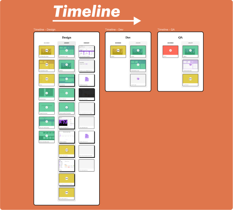
The team was still finding their ground in task tracking and thus I created a release timeline tracker with in depth insights about every feature and the team members working on it and its status.

Usability Testing
I found myself in a release schedule with very little time allotted to testing, so I created a research plan and gathered as many data points as I could
1.Task
9 tasks testing various portions of the product were conducted and their findings were captured to analyse and improve the experience.
Objective
To familiarize the user with the interface and inspect if the user is able to understand the product through the landing page.
To check for affordance of scroll icon and the content below.
Time: 2min 30sec

Expert assessment metrics

User Perception metrics
Parameters
Observations
Feedback
Ideas/Thoughts
Success Rate
Time Per task
Errors
Confusions
2.Feedback & Suggestions
A key aspect of usability testing is to not take the user feedback and suggestion as absolute, further analysis is key.
Affordance of the interaction

Emphasis on Metrics
3.Synthesis
Consolidated views of some of the qualitative and quantitative metrics captured.

Ease of use Index

Task success rate

Challenges
Pushing back against unneeded gamification
The idea of an MVP vs the timeline
Research in tight timelines
Autosave and versioning
Complex filtering
Legacy vs digitized
Switching between light & Dark Mode

Learnings
Showing the client the value of simplified flows and intrinsic motivators
Consensus on product features in the short and long run
Have a clear research plan, and test as many you have time for
Auto-save took Dev time and hence an interim design was adopted
Simplified lists and addition of tags and clear system status
A healthy combination of both achieved
Colour variables implemented to facilitate dark mode with ease
Grateful for the contributions and support of the team!

A wide set of people in development, design, etc, came together to bring this product to life. The team feels extremely connected and collaborative with the stakeholders as well!


More Projects

Adagio
Enhancing the product design by review & creation of a new, robust design system

Enable
Improving the experience of visually impaired test-takers using design thinking